


PROJECT
MATCHING APP FOR NEW PARENTS
SUMMARY
I designed the brand identity and user experience for a mobile app inspired by swipe-to-match platforms.
RESPONSIBILITIES
LEAD UI / UX DESIGNER
To kick off the project, we conducted user research and built personas for expecting parents, leveraging data from Bump Boxes to inform key user behaviors. Competitor analysis revealed a gap in the market, with existing solutions lacking sophistication and usability. I designed a gender-neutral, user-friendly interface with modern visuals and baby-inspired touches to balance functionality and charm.
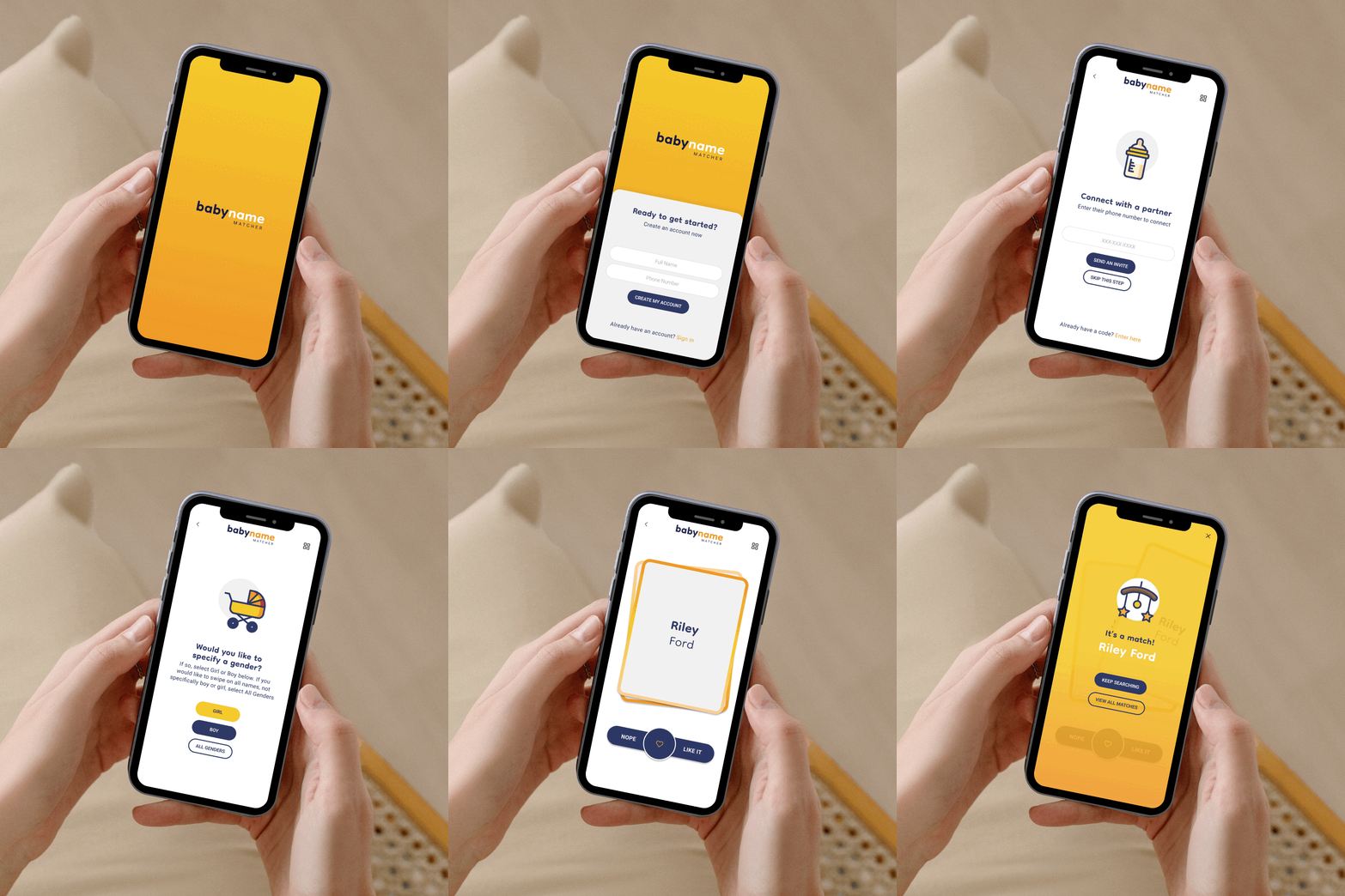

I began with low-fidelity wireframes to map the user journey, focusing on intuitive navigation, seamless sign-up flows, and clear call-to-action placements. Through iterative testing, we refined the designs for usability and accessibility. Once wireframes were validated, I developed the brand identity, including logo, color palette, and iconography, and integrated them into high-fidelity prototypes. Collaborating with the ReactNative developer, I ensured smooth implementation and iterated quickly to address feedback.


THE RESULTS
Reached goal of 500 sign ups on iOS and Android in first 6 months of launch with internal marketing only
The app’s core functionality allows users to swipe and save baby names, connecting with partners to see mutual matches. The user flow integrates backend data collection seamlessly, meeting business goals without disrupting the experience. Features like skip, back, and progress indicators enhance usability, while micro-animations bring the app to life.
_gif.png)